Note
Go to the end to download the full example code.
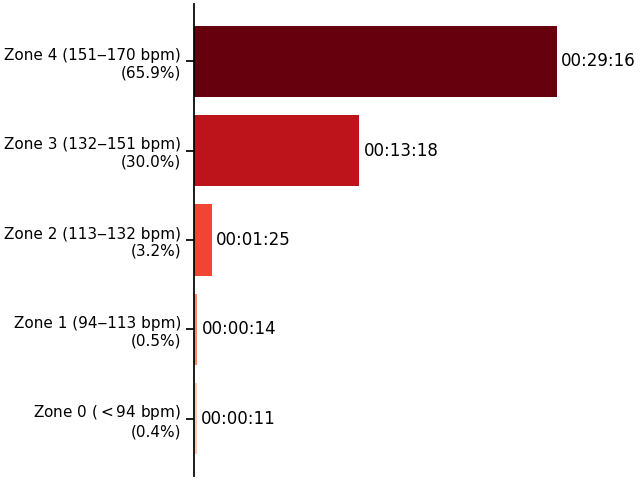
Bar chart of heart rate zones
This example will use the calculated heart rate zones from gpxplotter to show the fraction of time spent in the different zones.
Times are equal? True
import numpy as np
import seaborn as sns
from matplotlib import pyplot as plt

from gpxplotter import read_gpx_file
from gpxplotter.common import format_time_delta

sns.set_context("notebook")


MAX_HEART_RATE = 189


for track in read_gpx_file("example4.gpx", max_heart_rate=MAX_HEART_RATE):
    for j, segment in enumerate(track["segments"]):
        time = segment["time"]
        time_in_zones = {}
        for start, stop, value in segment["hr-regions"]:
            seconds = (time[stop] - time[start]).seconds
            if value not in time_in_zones:
                time_in_zones[value] = 0
            time_in_zones[value] += seconds
        sum_time = sum([val for _, val in time_in_zones.items()])
        # Check consistency:
        print("Times are equal?", sum_time == (time[-1] - time[0]).seconds)

        zone_txt = segment["zone_txt"]

        zones = sorted(list(time_in_zones.keys()))
        percent = {
            key: 100 * val / sum_time for key, val in time_in_zones.items()
        }
        labels = [
            f"Zone {i} ({zone_txt[i]})\n({percent[i]:.1f}%)" for i in zones
        ]
        values = [time_in_zones[i] for i in zones]
        times = format_time_delta(values)
        cmap = plt.colormaps.get_cmap("Reds")
        colors = cmap(np.linspace(0, 1, len(zones) + 1))
        colors = colors[1:]  # Skip the first color
        fig, ax1 = plt.subplots(constrained_layout=True)
        rects = ax1.barh(zones, values, align="center", tick_label=labels)
        for i, recti in enumerate(rects):
            recti.set_facecolor(colors[i])
            width = int(recti.get_width())
            yloc = recti.get_y() + recti.get_height() / 2
            ax1.annotate(
                times[i],
                xy=(width, yloc),
                xytext=(3, 0),
                textcoords="offset points",
                ha="left",
                va="center",
            )
        ax1.spines["top"].set_visible(False)
        ax1.spines["right"].set_visible(False)
        ax1.spines["bottom"].set_visible(False)
        ax1.tick_params(bottom=False)
        ax1.tick_params(labelbottom=False)
plt.show()
Total running time of the script: (0 minutes 0.401 seconds)